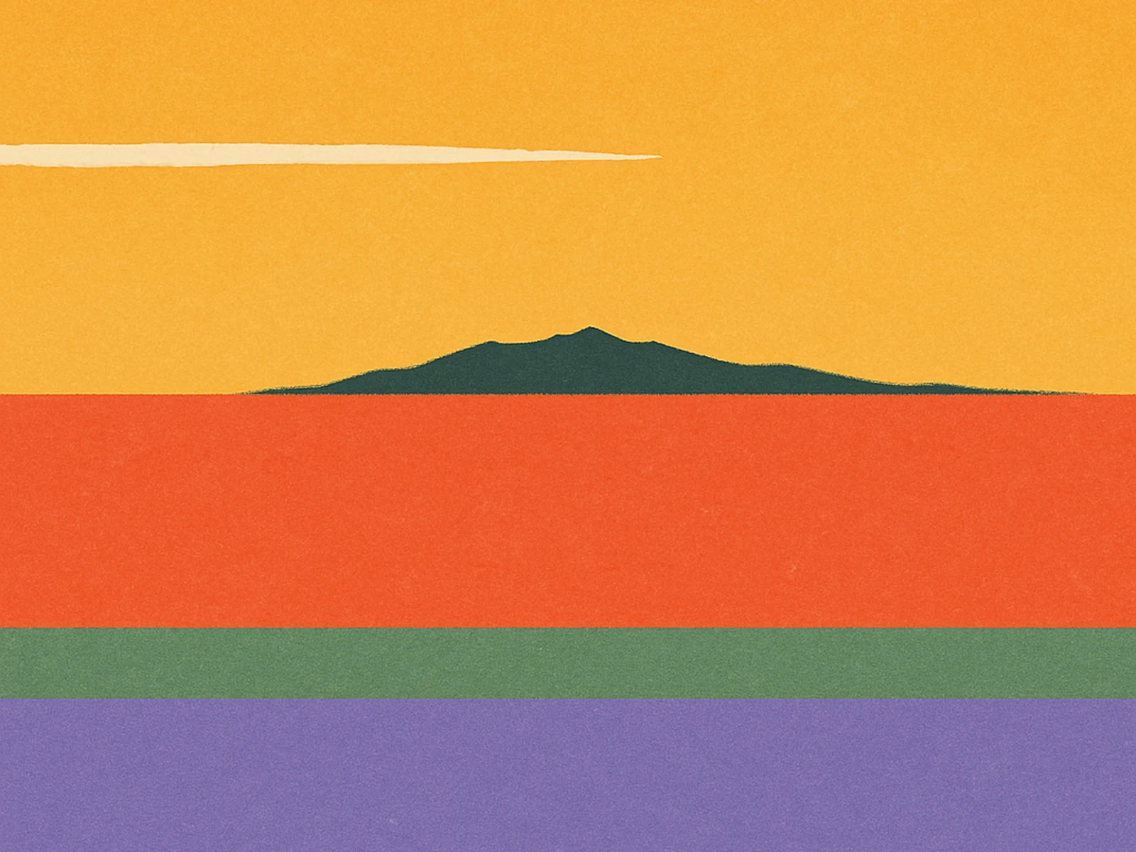
Ceuta is a Spanish city of about eighty thousand people on the African coast, separated from the Iberian peninsula by fourteen kilometres of water and from Tangier by about thirty. From the studio window you can see the Mediterranean to one side, the Atlantic to the other, and the Rif mountains in front of you. The light here is unlike any I have worked in elsewhere. It is whiter than in Barcelona, harder than in Tangier, and softer than the Andalusian sun on the other shore. The buildings are all painted in chalky off-whites and dusty pinks and faded yellows, and the strait is not blue, it is silver, then grey, then sometimes for ten minutes around six in the evening, exactly the colour of a coral peach.
We did not move the studio to Ceuta to make a point about colour. We moved here because rents in Barcelona had become absurd and because I had family on this side. But after the second year I noticed that our palette work for client briefs had changed. The colours we reach for are warmer than they were when we worked from a glass office on Plaça Catalunya, and softer. The whites we now use have noticeable yellow undertones; the dark inks we use are never pure black; the brights we use are pulled directly from the city around us — a particular coral that I think is the colour of the bougainvillea outside the old hospital, a marigold that is the colour of the awnings in the central market, a sage that is the colour of the dry hills above the port.
Climate is doing work here, but so is geography. Ceuta sits at the meeting point of two continents, two seas, and two design traditions — Iberian and Maghrebi — and you can see both in the urban texture if you walk for an afternoon. The Iberian tradition tends toward muted, deeply considered colour with high tonal control. The Maghrebi tradition tends toward saturated, structurally placed colour, often anchored by tilework. Our palette has, almost unconsciously, ended up somewhere in between, and it has, almost unconsciously, made our work feel like ours. Clients comment on it; they cannot always describe what they are responding to but they recognise it as ours when they see it again three projects later.
I am wary of writing too neatly about where a colour palette comes from. Designers love an origin story and origin stories are at best half-true. But after four years of working here I think the geographic argument is harder to dismiss than I assumed. We design from a particular place, in a particular light, in a particular city, and that place ends up in the work whether we plan for it or not. The most honest thing I can say about our colour system is that it is the city, projected onto a Figma file, and re-purposed at scale.