There is a useful test you can run on any brand to find out whether it actually has a voice or whether it is just well-art-directed on the front page. Find the unsubscribe confirmation page. Read it. Almost always, the brand vanishes there — the page is sterile, system-generated, lit with the default font of whoever wrote the email platform, and the brand voice is nowhere to be found. The expensive home page and the apologetic unsubscribe confirmation page do not look like they were made by the same studio, and that is because, almost always, they were not.
I started keeping a folder of well-designed boring pages four years ago. It now contains around three hundred screenshots. The pattern is consistent. The brands that hold their voice across the boring half are roughly five percent of the brands I look at. Of that five percent, almost all of them are small. Stripe is the obvious large-company outlier. Notion is occasionally another. Most of the brands you would think of as having strong identities — the agency websites you save to your inspiration board, the unicorns with the fashionable designers — fall apart somewhere in their account settings or in a 404 they did not anticipate. The brand was designed for the marketing surface, not for the product, and certainly not for the failure cases.
There is a real argument that this is fine. Most users will never see the empty state. Most subscribers will never unsubscribe. Most visitors will never encounter a 404. The boring half is, by definition, the surface area that does not generate growth, and a strict ROI lens will tell you to leave it alone. I have heard this argument made by sensible people I respect and I think it is wrong, for two reasons. First, when a user does encounter the boring half it is almost always at a moment of friction — they are confused, they are leaving, they have hit a dead end — and that is exactly the moment when a small, considered piece of design does the most work, because the user is paying attention. Second, the boring half is contagious; if your team is allowed to ship a sterile unsubscribe page, the standard of what is acceptable to ship slips quietly across the rest of the product.
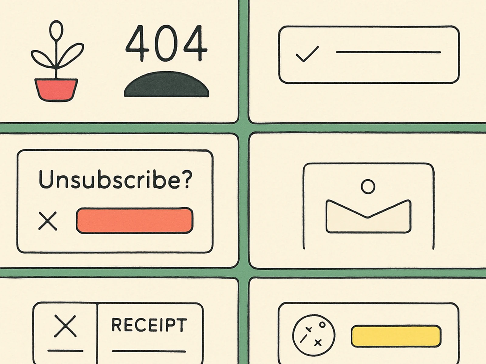
For our own clients we make a rule. About a third of any website engagement, by hours, goes to surfaces that the marketing team will never put in a deck. The 404. The empty inbox. The form-validation error states. The unsubscribe confirmation. The receipt page. The terms-of-service page. The cookie banner. The 500. These do not need to be elaborate; they almost never benefit from being elaborate. They need to look like they were made by the same designer who made the home page. Same colour system, same type, same writing voice, same care. The pages where the user is confused or leaving or angry are the pages where you find out whether the brand was a costume or a person. We try, with the work we make, to be on the side of the person.